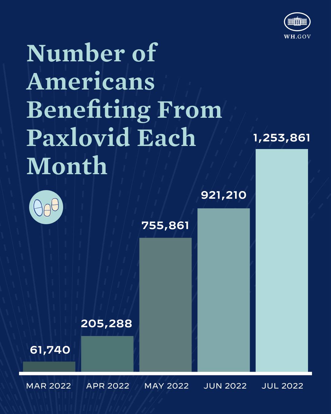
The image shows a blue background with text and a graph depicting the number of Americans benefiting from Paxlovid each month.
Read full description
The image shows a blue background with text and a graph depicting the number of Americans benefiting from Paxlovid each month. The graph is composed of several bars of varying heights, each representing a different month, with the height of each bar indicating the percentage of Americans who have benefited from the pandemic. The text on the blue background provides further information about the data, such as the total number of people who have been diagnosed with the virus.