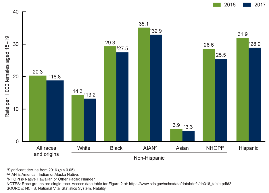
The image shows a bar chart depicting the number of people who have been diagnosed with cancer in the United States.
Read full description
The image shows a bar chart depicting the number of people who have been diagnosed with cancer in the United States. The chart is divided into sections, each representing a different race, and the height of each section indicates the percentage of people with cancer. The text on the chart provides further information about the data being presented.