Read full description
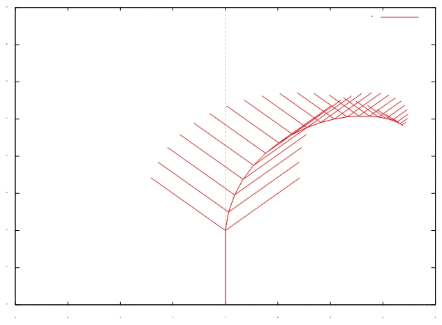
The image shows a plot of a line graph with a red line on a white background, depicting the distribution of the number of people who have been diagnosed with cancer. The graph is composed of a series of points connected by a line, with the x-axis representing the time period and the y-axis indicating the number. The red line is used to represent the distribution, while the white background provides a stark contrast to the graph.