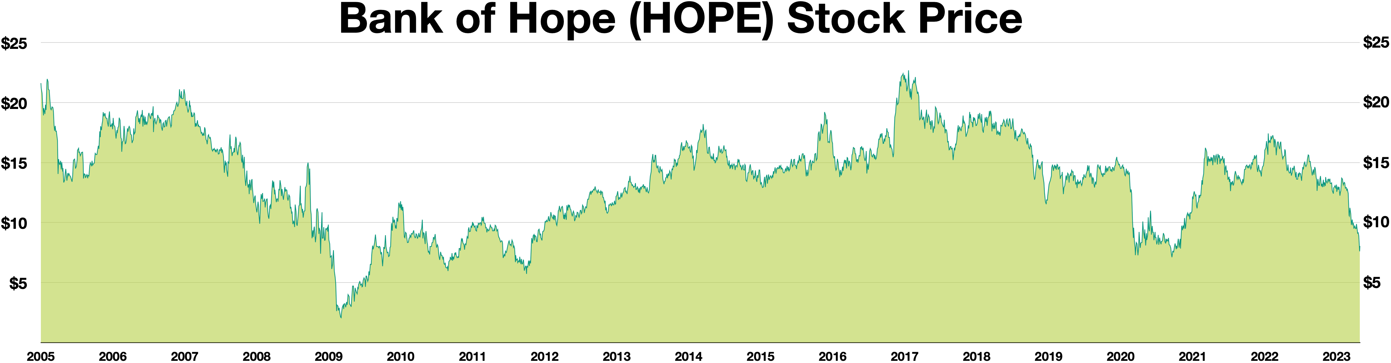
The image shows a graph of the Bank of Hope (HOPE) stock price over a period of time.
Read full description
The image shows a graph of the Bank of Hope (HOPE) stock price over a period of time. The graph is composed of a series of points connected by a line, with the x-axis representing the time period and the y-axis indicating the price of the stock. The text at the top of the graph reads "Bank of Hope" and the background is a light blue color.