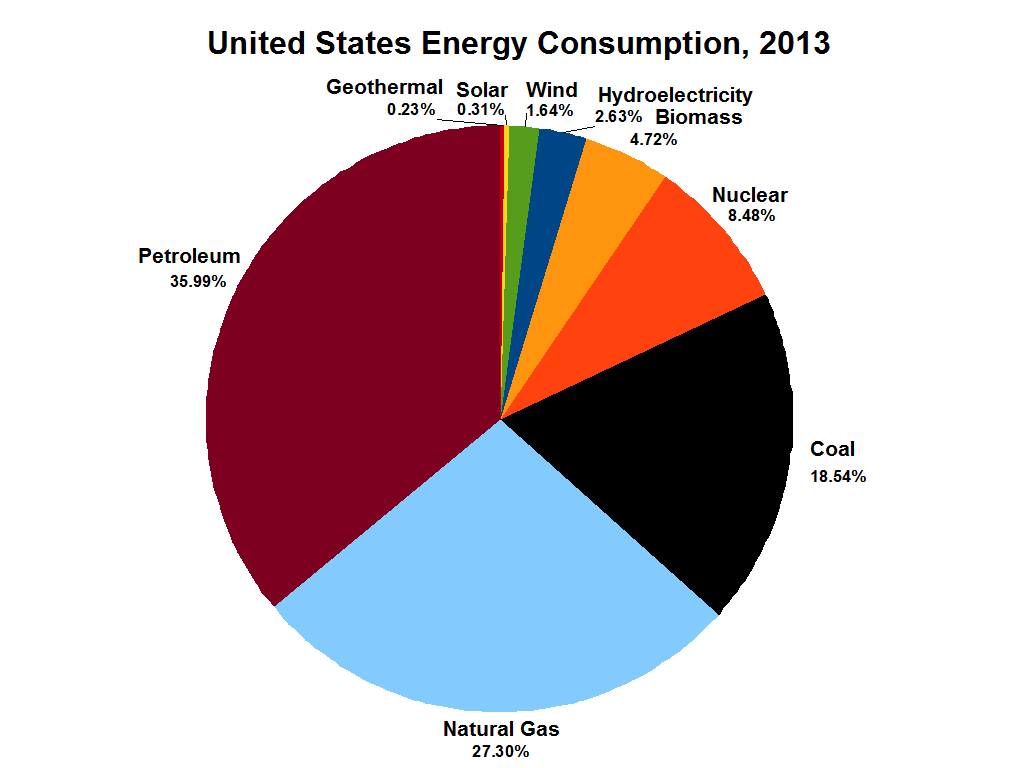
The image shows a pie chart depicting the United States energy consumption in 2013.
Read full description
The image shows a pie chart depicting the United States energy consumption in 2013. The chart is divided into sections, each representing a different energy source, such as coal, natural gas, and renewable energy sources. The size of each section indicates the percentage of energy consumed by each source.