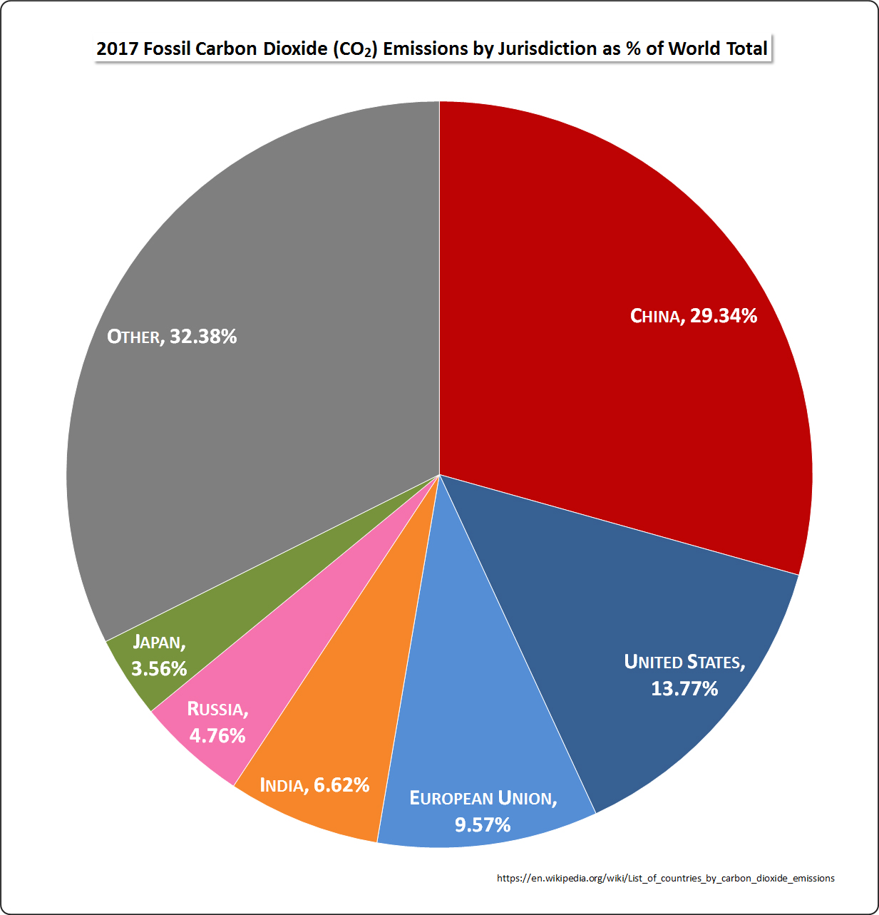
The image shows a pie chart depicting the 2017 fossil carbon dioxide emissions by jurisdiction as % of the world total.
Read full description
The image shows a pie chart depicting the 2017 fossil carbon dioxide emissions by jurisdiction as % of the world total. The chart is divided into sections, each representing a different jurisdiction, and the size of each section indicates the percentage of emissions.