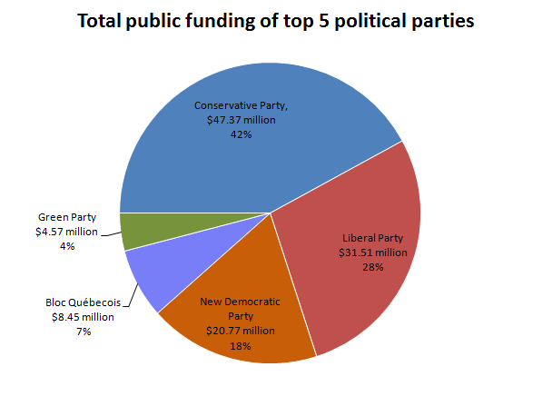
The image shows a pie chart depicting the total public funding of top 5 political parties.
Read full description
The image shows a pie chart depicting the total public funding of top 5 political parties. The chart is divided into sections, each representing a different party, and the size of each section indicates the amount of funding for each party.