Read full description
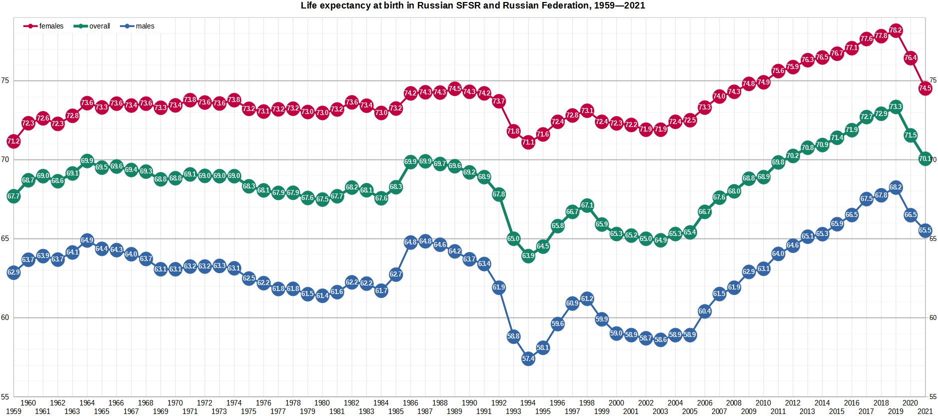
The image shows a graph on a white background with different colored lines representing the life expectancy at birth in Russian SFS and Russian Federation from 1959 to 2021. The graph displays the number of people who have lived in the United States over a period of time.