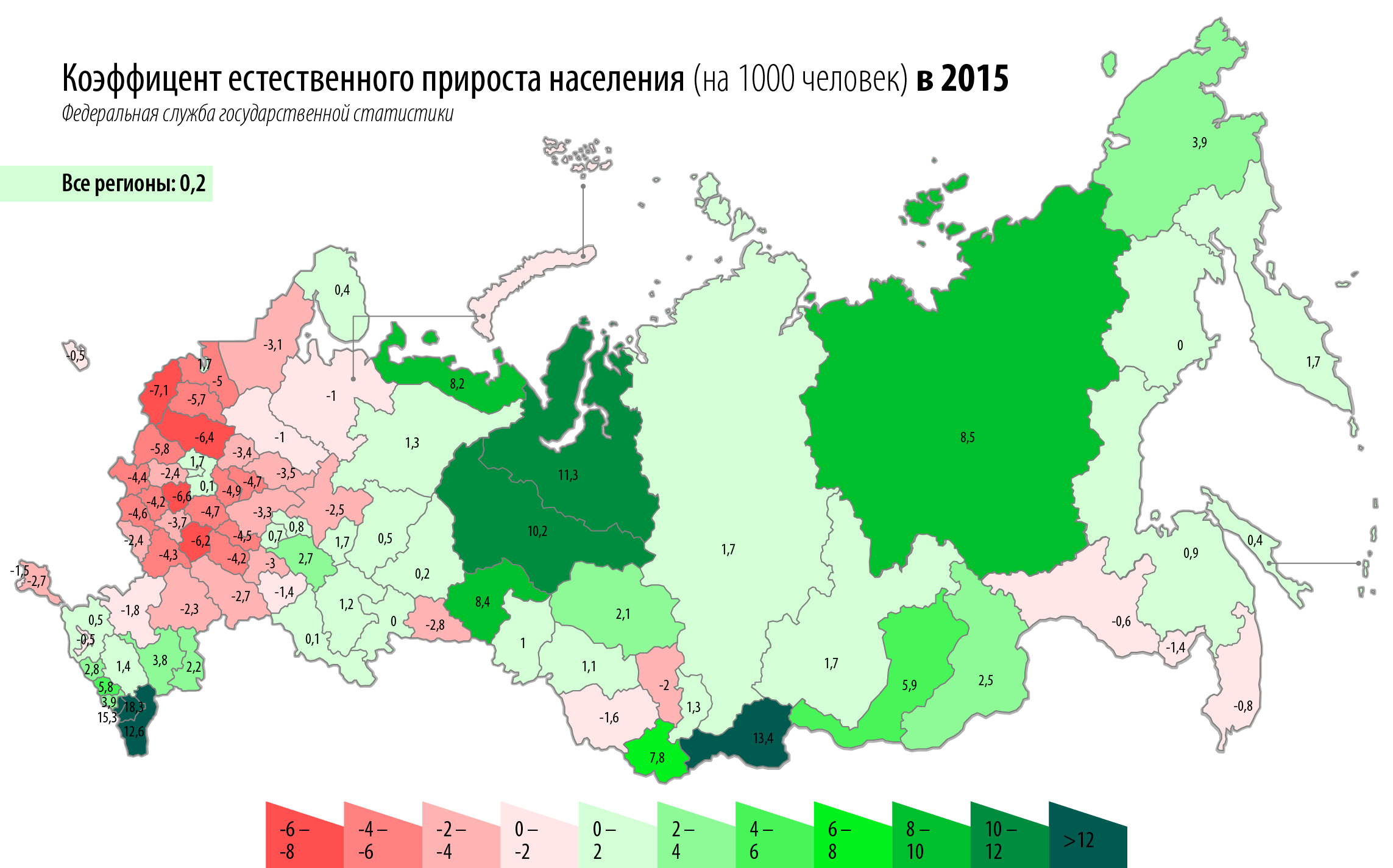
The image shows a map of Russia with different colors representing the percentage of people living in each country.
Read full description
The image shows a map of Russia with different colors representing the percentage of people living in each country. The text at the top of the image reads "Russia Pollution 2015". The map is divided into different sections, each representing a different percentage of the population in Russia. The colors range from light blue to dark blue, indicating the highest percentage of population in each region.