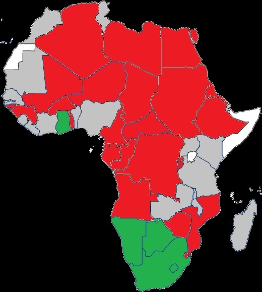
The image shows a map of Africa with different colors representing the percentage of people living in each country.
Read full description
The image shows a map of Africa with different colors representing the percentage of people living in each country. The colors range from light blue to dark blue, with the darker blue representing the majority of the population. The map also shows the borders of the countries, with each country outlined in a different color.