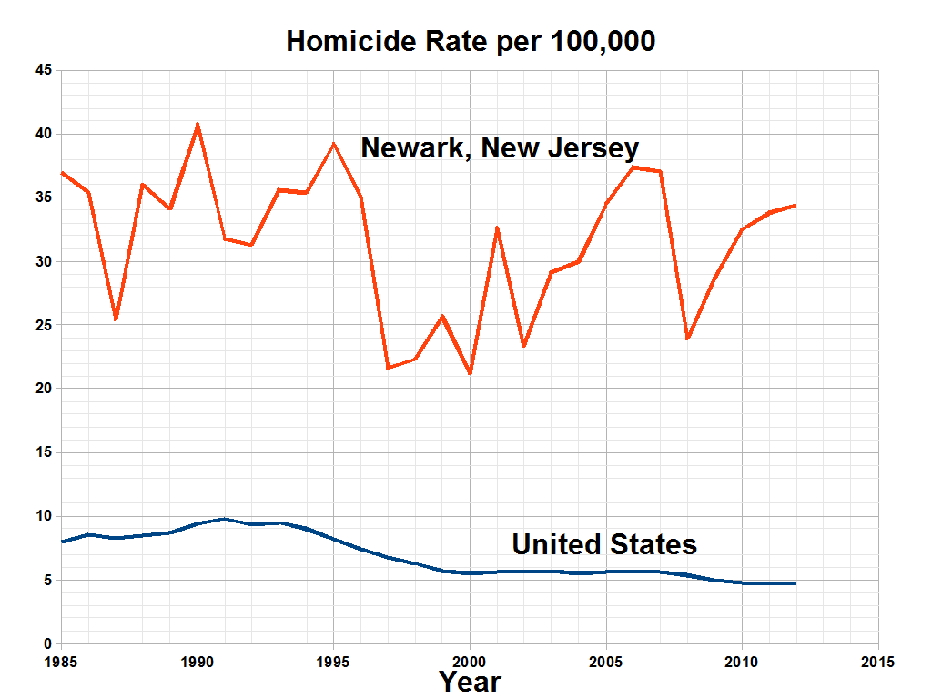
The image shows a graph depicting the homicide rate per 100,000 in Newark, New Jersey.
Read full description
The image shows a graph depicting the homicide rate per 100,000 in Newark, New Jersey. The graph is composed of two lines, one in blue and one in red, that represent the rate of homicide in each state. The blue line is steadily increasing, while the red line is decreasing, indicating a decrease in homicide rate. The text on the graph provides further information about the rate.