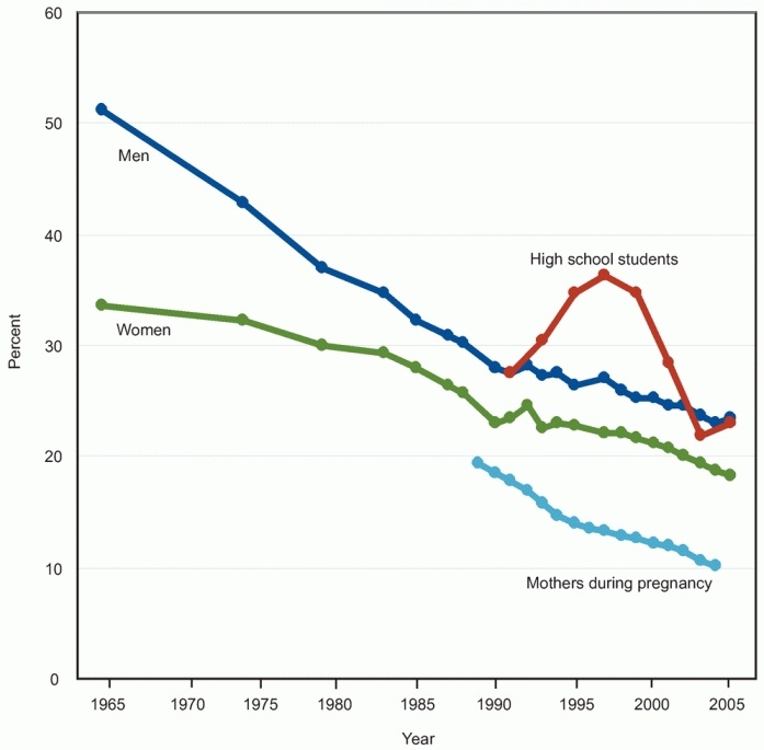
The image shows a line graph depicting the number of people who have been diagnosed with cancer in the United States.
Read full description
The image shows a line graph depicting the number of people who have been diagnosed with cancer in the United States. The graph is divided into four sections, each representing a different age group: men, women, and high school students. The x-axis of the graph is labeled with the years, while the y-axis is labeled as the percentage of people diagnosed with the disease. The colors of the lines vary, indicating the different age groups.