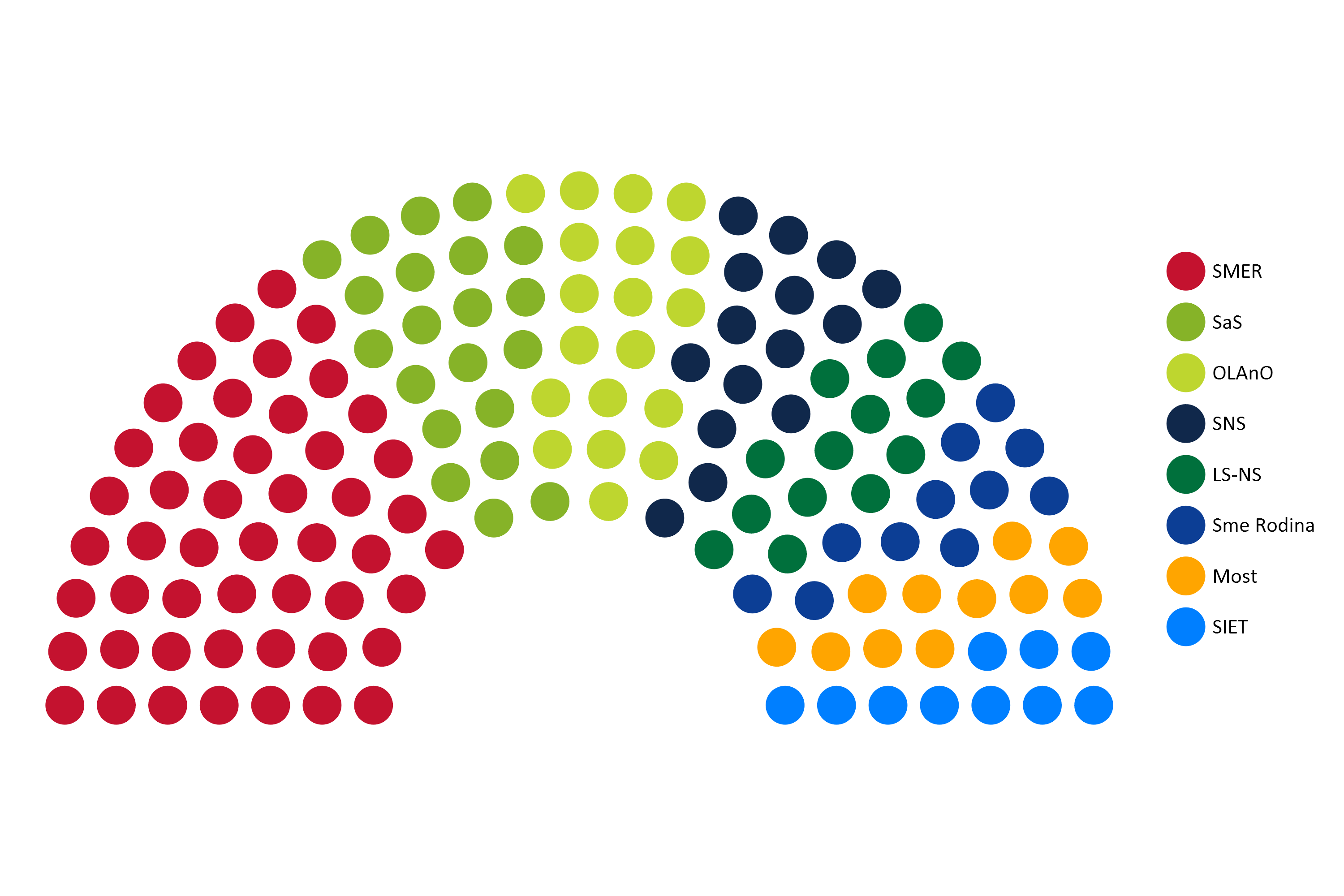
The image shows a pie chart with different colored circles representing the number of people who have been diagnosed with cancer.
Read full description
The image shows a pie chart with different colored circles representing the number of people who have been diagnosed with cancer. The circles are arranged in a circular pattern, with each color representing a different type of cancer. On the right side of the image, there is text that provides further information about the chart.