Public domain photos
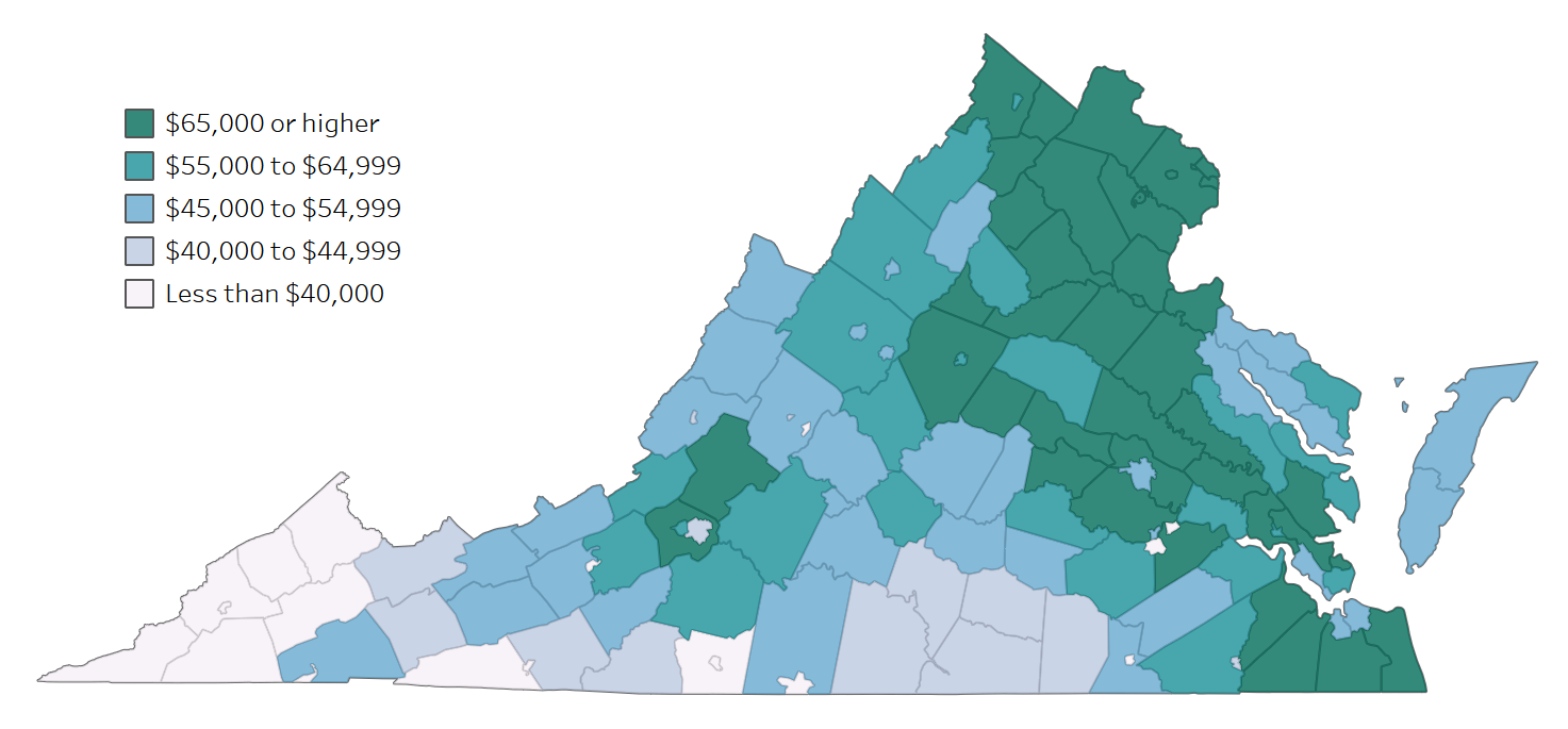
The image shows a map of Virginia with different colors representing the percentage of people living in each state. On the left side of the map, there is text indicating that the map is showing the average cost of living in the state.
 Open in library