Public domain photos
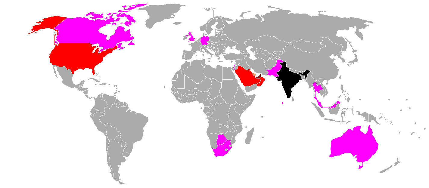
The image shows a map of the world with different colors representing the percentage of people living in each country. The colors range from light blue to dark blue, with the darker blue indicating the highest percentage. The map also shows the names of the countries that have been affected by the pandemic.
 Open in library