Public domain photos
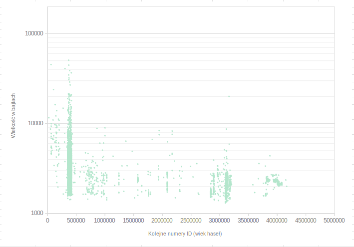
The image shows a scatter plot with a white background, displaying the number of people who have been diagnosed with cancer. The plot is composed of a series of points connected by a line, with the x-axis representing the time period and the y-axis indicating the number. The points are colored in shades of blue, green, and red, indicating the severity of the disease.
 Open in library