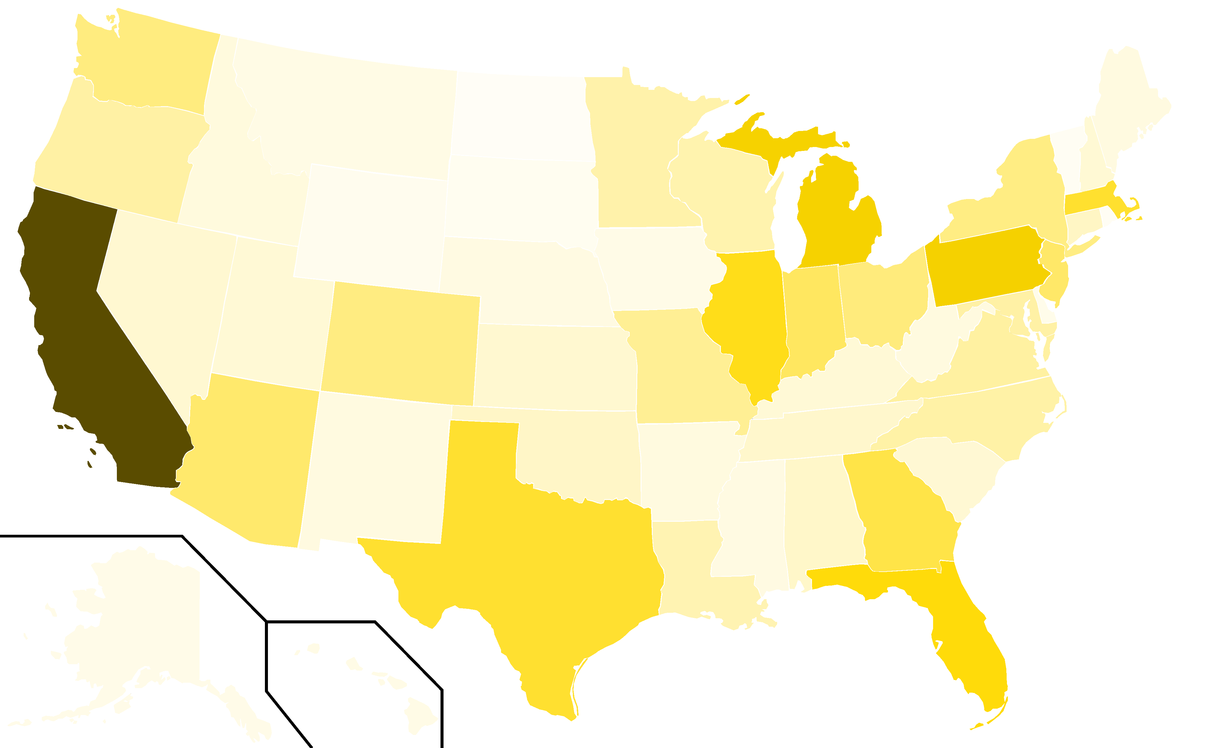
The image shows a map of the United States with the percentage of people living in each state.
Read full description
The image shows a map of the United States with the percentage of people living in each state. The map is divided into different colors, with each state represented by a different color. The colors range from light blue to dark blue, with some areas being darker blue and others being lighter blue. The text on the map reads "Percentage of People Living in Each State".