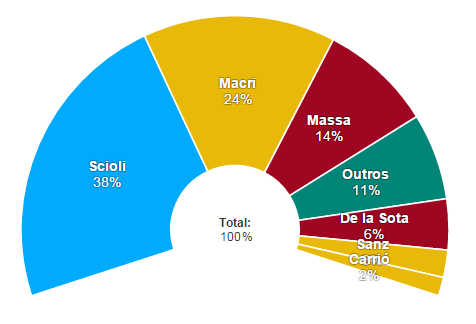
The image shows a pie chart with different colors representing the percentage of people who have been diagnosed with cancer.
Read full description
The image shows a pie chart with different colors representing the percentage of people who have been diagnosed with cancer. The chart is divided into sections, each representing a different type of cancer, such as macri, massa, and outros.