Read full description
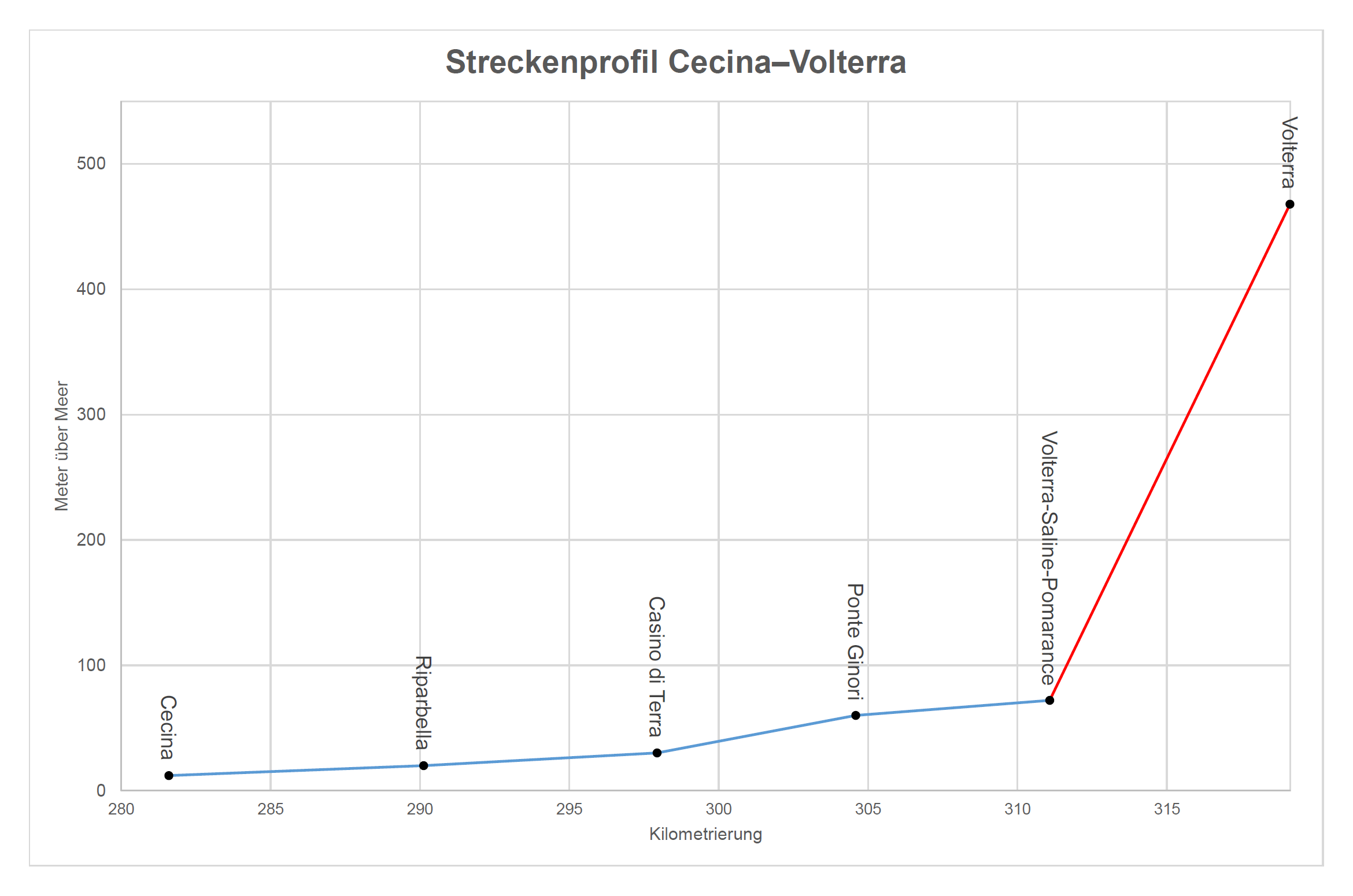
The image shows a graph on a white background with text that reads "streckenprofil cecina-volterra - vollterra" which is a line graph that illustrates the correlation between the number of people who have been diagnosed with cancer. The graph is composed of two lines, one in blue and one in red, that intersect at various points on the x-axis. The blue line is labeled "Cecina" and the red line is labelled "Volterra". The graph also includes a legend that explains the meaning of the colors used in the graph.